A few years have passed by since the "mobile phenomenon" started taking over the internet, meaning that people nowadays prefer to utilise their mobile phones to do their web searches rather than with a PC. People previously relied on their PCs rather than mobile phones, but technology has spread so much that over the last few decades, we witnessed mobile searches overtaking PCs.
So we are pretty much doing every single task through our smartphones, don't you consider it is time to start wondering if your business is up to the challenge and up to the change? Because if you´re not and you haven't stepped up the bar onto the mobile-friendly level, chances are you´re missing out.
This article is about how well prepared for the change is your business's website, and more importantly: is it well equipped to be mobile-friendly?
Everything started a few years ago when Google noticed that mobile searches were bigger than desktop searches. This increment was so significant that more recently they decided to do a substantial change in its algorithm, resulting in Google leaning towards the mobile-friendly websites in their search results. It was called "Mobilegeddon", and it went hard on the websites that were not mobile friendly, something that should concern anyone managing a website.
If your business website is not optimised in a way it can be perfectly accessed and used through mobile devices, then your customers or potential customers are more likely to leave your site. The growing demand and usage of smartphones and tablets mean that mobile-friendly compatibility is essential.
But the reasons why should your website be mobile-friendly, go far beyond Google's algorithm. In terms of population, UK currently shows that 95% of its population owns a smartphone and uses it on a constant basis, that means a lot of people walk around carrying these devices wherever they go, and rumour has it that they use it to do their web searches. No one can deny the positive sales effect that a mobile-friendly website can grant to a business of any sort.

When customers are considering to make a purchase 80% use their smartphones, hence they demand a website that os mobile-friendly. That goes to show what may happen to a business whose website is not mobile-friendly. Surprisingly, did you know that in 2015 more than half the companies listed in FORTUNE 500 did not have mobile-friendly websites?
Now, mobile-friendly also means that it is not a standard template web design, so it favours a bespoke website, and as such, it must be created by fully committed professionals who can take your business high, something that Google fancies. Make sure that the agency you pick meets your quality and reliability standards.

There are of course some technical aspects that contribute to having an excellent mobile-friendly website, here are some considerations about it:
Make good use of the tiny screen, use it wisely; otherwise, your customers will hit the wrong button many times.
Such buttons need to be easy to find (sign-up, buy etc.)
Avoid time-consuming transactions. Customers should be able to perform these actions as fast as possible.
Compress images correctly so the page can load rapidly. Google statistics show that if a page takes more than 3 seconds to load, chances are customers will close it and move on to the next vendor.
The mobile-friendly site should meet some smartphone touch requirements like tapping or scrolling.
Landing Page (this is where your customers will "land" whenever they access your website) should be heavily oriented towards action, so you get your customers where you want them to be.
This item is an important one: Fit for local searches. A vast majority of mobile searches are meant for local purposes. Make sure you put Northampton on the map.

Now that you are entirely determined to have a website that is mobile friendly, it is time to start thinking on how to get one. Well, during this stage you have one option,
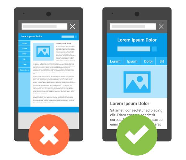
Your option is to go with Responsive Web Design, and what this does basically is to make your mobile-friendly website to render well on several types of screens and devices. It detects the size of the screen the potential customer or visitor is using.
A few more tips before we wrap everything up:
Neverending testing: Keep testing your responsive website as much as you can. Test it on Android, iPhone and so on, and not just on one device. Test every button, user action. Hell, put your family to test it, you´ll get the best feedback from users and people who were not involved in the design.
High-resolution images: They will always help improve your website, plus it adds a professional element to the design.