The Psychology of colour.
There have been many studies made that have proven it is best to choose a colour that will suit your company's personality. This is the reason why you will want to think about the message you want to transmit to all your clients. A very high percentage of customers have stated that the main reason why they buy a product is the colour.
The colours and their meanings.
White.
The colour white is known for representing, freedom, innocence, purity and openness. it can also represent a successful beginning.
Red.
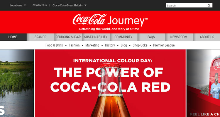
The colour Red is linked with the strength, warmth and excitement. It has also been associated to create urgency, energy and increase the heart rate while showing determination and passion.
Blue.
The color blue is known for the feeling of trust, security and loyalty, it gives to a person. Blue works well for the corporate world and is often used for more conservative types of business such as accountants, banks, insurance companies and many other financial companies where trust and reliability are truly important.

Green.
The colour Green has always been linked to the environment and nature, renewal, harmony and growth, good for gardening, creativity & outdoor activities while being also the more comfortable colour for the eye to process.
Yellow.
The colour yellow represents happiness and is known as good for children’s toys. Yellow is the color of sunshine and it is associated with joy, intellect and energy, It is mostly used to grab the attention of window shoppers in order to get potential clients as it produces a warming effect, stimulates mental activity and cheerfulness.
Purple.
Purple is often taken as the colour of luxury, wisdom and grandeur with a soothing and calmer side. Purple is used more often in beauty and anti-aging products. It conveys wealth, extravagance, dignity and independence.
Black.
The colour black shows sophistication, elegance, mystery and glamour, it is suitable for luxurious products, this colour is often seen as sturdy and sleek. It is considered to be a very formal and prestigious colour.

Think bright for your conversions.
Recent studies have shown that often the bright colours work much better for converting your visitors into your customers. On the other hand, dark tones have shown the opposite and having no success.
Think Red, Think orange, green, yellow and try to avoid purple, brown, black and dark tones.
Think about your company and choose what colours reflect your brand better.
Try using these suggestions on your website, by choosing the colours that your brand reflects and shows what your company is made of. You will create a message that attracts the customers and will increase all the opportunities for your future visitors to also convert into your loyal customers.
If you have any other doubts or questions if you want to involve colours in your web design, please do not hesitate to contact DYSC. We are here to help by giving you the best answer and providing the best solution.